


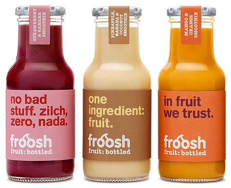
I love everything about this Swedish urban smoothie brand Froosh. The packaging colors work very well with the juice tones, the typeface is simple, the logo is charming and the snappy messages are both playful and nicely portray the brand's philosophy. Designed by Pearlfisher.
via The Dieline
2 comments:
I adore these bottles - the "rotating" text is genius. I especially like "no bad stuff. zilch, zero, nada.
Love the packaging.
Post a Comment