


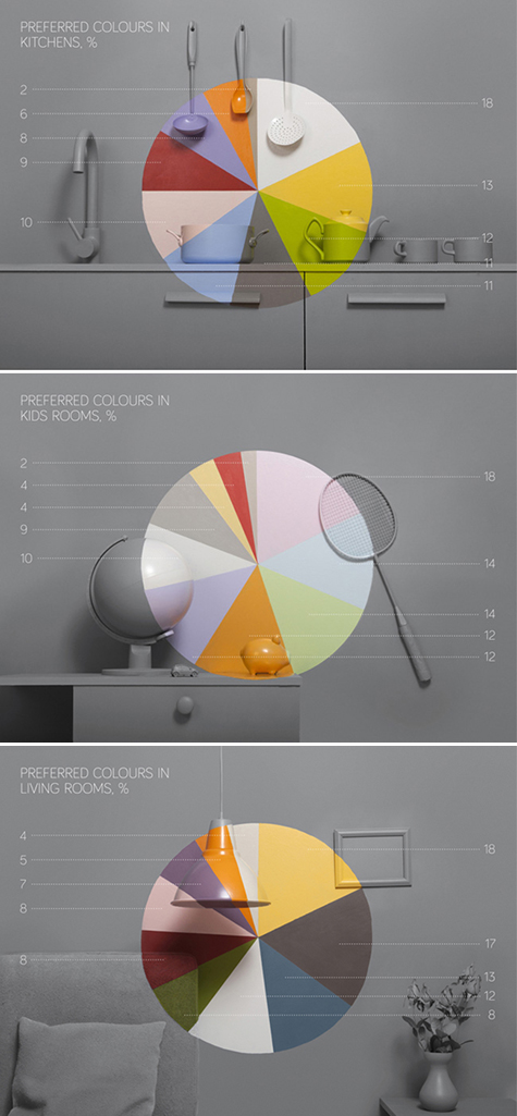
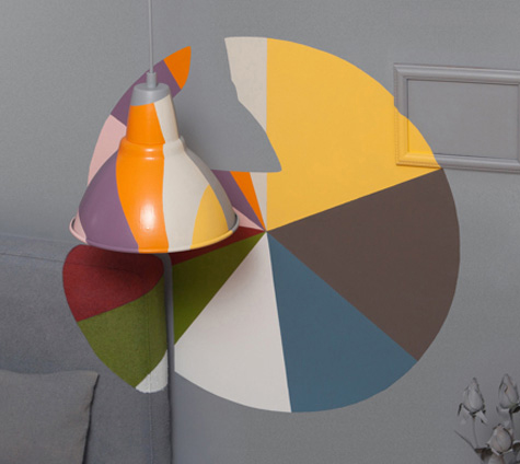
I was blown away as soon as I laid eyes on this clever project by Mie Frey Damgaard and Peter Ørntoft. Paint color preference by room was visualized as physical pie charts, cleverly painted in a dimensional scene to appear 2d, but accompanied by the subtle depth of natural shadows. This data visualization is the result of colour statistics extracted from Pinterest, a content sharing platform effecting millions of consumers' decoration decisions. Created for the paint brand Jotun.
Happy Friday!
via Plenty of Colour
No comments:
Post a Comment