cammeo jars


cammeo

I have so many ideas for these clever bone china jars designed by Louise Campbell, produced by Kahler. I'm a sucker for white objects with bold colour accents, and I love that the thick rubber band is both aesthetic and functional.

via Grassrootsmodern

field of light by bruce munro


fieldlight

Field of Light was an installation at the Eden Project in Cornwall, England by lighting designer Bruce Munro, which recently closed in March. The installation was comprised of 6,000 acrylic stems with fibre optic cables that represent light flowers or seeds that "blossom" at night. You can view a video of the installation here.

"I wanted to create a field of light stems, that like the dormant seed in a dry desert would quietly wait until darkness falls, and then under a blazing blanket of southern stars bloom with gentle rhythms of light. "

via Dezeen

tattoo test by juliann miller


tattootest

Graphic design student JuliAnn Miller designed this Tattoo Test for a recent class project. Wow, I know too many people that could have used this!

"We were to design work for a social or political cause; I chose tattoos for my topic," she says. "This Tattoo Tester is a kit that comes with certain papers so that the user can create custom temporary tattoos (transfer paper and carbon paper). The kit also includes a brochure with information on tattoo statistics and a brief history of tattooing."

via The Dieline

tone furniture by leif.designpark


tone

Designed by Leif.designpark, Tone and Tone Kids accentuates the unstained natural colours of wood (walnut, oak, chestnut and cherry) using the Japanese craft of parquetry in a contemporary design. It is distributed through De La Espada.

the spice outfit packaging


spiceoutfit

Designed by MondoVox, The Spice Outfit is a specialty line of spices and meat rubs from Chicago that uses gangster imagery and vocabulary from the 20's and 30's in Chicago as its aesthetic. The mugshots and spice titles really made my day.

via The Dieline

national postal musem


mailmap

Arago: People, Postage and the Post is an online collection from the National Postal Museum. It is loaded with images of postal history, stamps, maps and equipment. LOVED this map!

via Sub-Studio

friday inspiration


hybrid

Well, my holiday is just about over and I get to see my Justin in three days! This print sums us up beautifully. Bike Love by Hybrid Home.

bailey doesn't bark ceramics


bailey

Bailey Doesn't Bark enjoys making art that can be enjoyed in every day life, and thus uses homewares as her medium. Her ceramics are both beautiful and functional. Shown above: Dot Tea Series, The Four Seasons Cups, and Flamingos and Trees Bowl.

nature and art


natureart

These two artists have recently caught my eye due to their choice of materials in their sculpture pieces. Hilary Berseth builds a framework of his sculpture from wire and wax, then hands it over to the bees to add their finishing touches. The process is long and wonderfully unpredictable.

"Coexistence is an elegant new installation that integrates ceramics and horticulture by Mineo Mizuno and opening at the Samuel Freeman on February 14. Mizuno, an artist with an expertise in glazes, starts with large pebble forms that are dotted with holes, then planted with moss. After a precise schedule of shade and mist, the moss develops into an organic glaze. The outer covering remains responsive to the effects of temperature and moisture."

via NY Magazine and MoCo Loco

sfida football by mikiya kobayashi


soccer

SFIDA Football, designed by Japanese designer Mikiya Kobayashi, is the first football for the SFIDA brand and approved by the Japanese Football Association.

About the design:
"Imagine the ball as the Earth. First plant the seeds in Tokyo, gradually expand the fields, and spreading the seeds all over the world. Let the flowers bloom all over the world!"

Cute.

furin wind chimes installation


furin


Furin Wind Chimes was an interactive installation for Okamura Design Space R, developed by Toyo Ito and Takram Design Engineering. The installation closed in August 2008. Lovely, yes?

From designboom:
"On a grid of equilateral triangles, 280 glass wind chimes were hung from the ceiling at varying heights to represent the undulation of a wave. As you walk
underneath the wind chime, not only does it ring, but its LED also alights like a firefly. Wind chimes nearer to the ceiling ring in higher tones, and those hung lower in lower tones together offering 10 degrees of tonal expression.

Additionally, the wind chimes are networked together, so that the sound and light spreads to adjacent wind chimes like ripples in the water. This network system was based on the idea of 'behavior' we observe among certain animals in nature that form groups."

via designboom

diy lcd card


lcdcard

Sorry, not the greatest pictures - but a fun idea nonetheless! DIY LCD Card, available from Present&Correct.

el mil del poaig olive oil packaging


elmiloil

El Mil Del Poaig boasts about their millennial olive trees, and how their exclusive extra virgin olive oil offers health, history, luxury. Their ceramic bottle design is minimal and pure, representative of the product inside.

Designed by Spain-based CuldeSac.

via designboom

kate mccgwire


katemc

I am most drawn to the work of Kate MccGwire that uses feathers as its medium. Feathers are a familiar object that she redefines into a materials that powerfully surges. Shown above: Deave, Sluice, and Retch.

From her website:
"Much of Kate's work references Freud's 'Unheimliche' (the uncanny, or, literally, the 'unhomely'); the idea, to quote Freud, of 'a place where the familiar can somehow excite fear'. It also embraces artistic notions of the Abject."

stitching postcards


maps

Stitching Postcard - Personalize your travel correspondences with a little DIY by stitching your travel routes/destinations.

dancing chair by constance guisset


dancechair

I really can't such much to this chair, other than wow. An absolutely beautiful gesture - Dancing Chair by Constance Guisset.

via Contemporist

hamburgerpanda illustrations


hamburger

Super cute robot sea life illustrations by Hamburgerpanda - available over at Etsy!

paper dioramas by sarah mcneil


smcneil

Paper dioramas by Melbourne-based Sarah McNeil.

via Pikaland

edible packaging


edible

Bugs. Food. Packaging. Insectivore foods Edible.

"For centuries Insect consumption has been part of the everyday diet of many of the world's human inhabitants from the Aborigines of Australia and their favoured delicacy of Witjutie grubs to the night markets of Thailand where crisp, fried Locusts and Beetles are favourite snacks to be consumed with an ice cold beer! We in the west have closed our minds to Insect eating (also known as Entomophagy) but In doing so have forgotten that these are one of the most nutritious foods available, higher in protein levels than chicken and cholesterol free."

via Lovely Packaging

friday inspiration


xuelei

Porcelain cans by Lei Xue.

via 2Modern

furniture by matthias pliessnig


plessing1
plessing2

Matthias Pliessnig has some truly wicked woodworking abilities. His work is beautifully engineered and an intriguing display of three-dimensional linework.

I am curious to know more of his process, if he uses any sort of computer modeling programs to influence his forms. Shown above: "Bends" and "Providence."

concrete planters by obleeek objects


obleeek

Obleeek Objects produces some simple, asymmetrical concrete planters. They use a custom concrete that is 40% lighter than standard concrete and has a smoother finish. Good for the eyes and the back!

via Design Milk

systematic landscapes by maya lin


mayalin

From the moment I first saw Maya Lin's website, I fell hard for her. She integrates the landscape, be it literally (as her material) or figuratively (as her subject), into every piece of art and architecture she designs.

Above are images from Systematic Landscapes, a exhibit that ended in January at the De Young Museum in San Francisco. Seriously, swoon!

via designboom

rosenberg textiles


rosenberg

Some nice black and white bedding textiles from Copenhagen-based Rosenberg.

dual logos


duallogo

Some of my dual logo favourites from this recent post. Clever clever.

via Fuel Your Creativity

aromamora packaging by nendo


aromamora

Aromamora oil and diffuser packaging by Nendo

"Aromamora [is] a line of essential oils blended specially for each season by aromatherapist Ohashi Maki. Until now, essential oil aficionados had to purchase both a bottle of their favourite oil and a diffuser to enjoy its fragrance. Our innovative design combines the functions of a bottle cap and a diffuser into one.

Small batch manufacturing also allows us to change the design with the seasons too. With its base that recalls a magic pumpkin, a pot, a witch's cauldron or a perfume bottle cap and accents reminiscent of a zipper, a key, or a drawer that seals something valuable, the bottle design allows aromamora's unique world to unfold, one scented moment at a time."

paper cutout drawings by bovey lee


bovielee

Bovey Lee puts a contemporary twist the ancient Chinese folk art of paper cutting. The details are absolutely ridiculous!

via designboom

foldschool cardboard furniture


foldschool

Foldschool is a collection of free cardboard furniture for kids, handmade by you. The downloadable patterns can be printed out with any printer. The collection includes a stool, chair and rocker. Cheap and sweet!

grassland: real grass applications


grassland

Grassland produces visually stunning real grass applications for residential and commercial interior spaces. Their applications are both flat, as seen in their panel-like objects (above), and also spherical as hanging orbs. The real beauty of the natural material comes from its change in colour over time - from a rich, deep green to a light straw.

About the material:
"The grass grows not on soil but on various materials – using water, light and the power of the seeds only. The roots intertwine and form a joint area that, with the aid of the special technique of drying, will stick even on stainless steel. The grass is conserved through the process of drying only and needs no further maintenance."

mccraw's confections packaging


mccraws

Mmmm, love the nostalgic aesthetic of this confection packaging! McCraw's Confections by Craig Skinner.

via The Dieline

naturally dyed eggs


eggs

Naturally dyed eggs by Stephanie Barnes - best colours ever. Happy Easter!

via Creature Comforts

heldentica


paste

Heldentica - get it? Ha. See all the alternative material type here.

more lovely desks


desks1

More desks - these I admire for their assembly and adjustability details.

{ 1 } Treteaux Desk by Ligne Roset
{ 2 } Enchord Desk by Herman Miller
{ 3 } Sox Table by Tobias Berneth
{ 4 } Trestle Table by Nicola Enrico Stäubli
{ 5 } Tréteau Desk by Philippe Nigro

lovely wood(ish) desks


desks

Here are a few desks I've recently been pining for!

{ 1 } Xbien Table
{ 2 } Airia Desk by Herman Miller
{ 3 } Swoop Desk by CB2
{ 4 } Bulego Desk by Nueva Linea
{ 5 } Delta Desk by Brave Space Design

dry soda


drysoda

This post is focused on both the packaging and the beverage. Dry Soda, designed by Seattle-based 
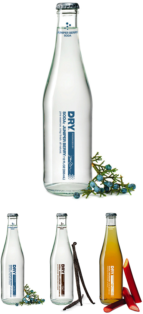
Turnstyle, is a sophisticated, non-alcoholic drink that is to be paired with fine dining. The idea was inspired by Dry Soda's founder, Sharelle Klaus, who yearned for a wine alternative whilst going through four pregnancies. This concept is great also for those who are straight edge, like myself, or those who refrain from alcohol for medical or religious reasons.

“Designed for those seeking a sophisticated, non-alcoholic beverage option, DRY Soda Co. produces lightly sweet, all-natural, culinary sodas. The sodas were developed specifically to be paired with great foods. To this end, DRY wanted the bottles to look at home in an upscale restaurant or at a five star hotel. Our design solution was intentionally minimalist."

via Lovely Package

tonale by david chipperfield and alessi


tonale

Designed by David Chipperfield, Alessi's new tableware line Tonale uses soft minimal lines and a desaturated palette. Tonale refers to Giorgio Morandi's use of color tonality imbuing his daily objects with a sense of individuality.

rosebud felt bowl


felt

Found this Rosebud Felt Bowl by Domestic Aesthetic over at Branch. What a beautiful, simple form with tons of uses! Made from a single piece of 100% industrial felt, held in floral bud form by magnets.

modern coin banks for baby


banks
Cutie banks for little ones that complement a modern style.

{ 1 } Elegant Baby
{ 2 } J Schatz Egg Banks
{ 3 } Dwell Studio
{ 4 } Theosaurus

via Twig & Thistle

velorbis bicycles


velorbis

Who wouldn't want to look this sexy on a bike? Velorbis is just another example of stunning Dutch design that I can't wait to get my hands on. My favourite is the Victoria Classic, shown above in side view.

living proof's no frizz packaging


frizz

Living Proof's No Frizz packaging is gorgeous. The logo is brilliant and direct. The form is rather unique to other haircare products on the market, especially the bottles' caps.

My only change? I would to see all the straightening-related products with the large white caps (the silhouette looking like long, straight hair) whilst the curling products use the small white caps (the silhouette looking like one curl or wave). The image above shows the packaging in this manner, but their website shows the products going back and forth, using both cap forms for both products.

via The Dieline

friday inspiration III


laviada

Photo Sculptures by Alejandra Laviada

PS. Can you tell my friday theme is color transition?

friday inspiration II


cbonnet

Pantone, Niveaux de ciel and Niveau de gris by Christelle Bonnet

friday inspiration I


bingman

Everything Color Circle by Brooke Inman

via Design Milk

daub and bauble packaging


daub

Daub & Bauble offers their home and personal care products in "edition packaging" - label patterns change with every new reprint of the product, keeping the designs fresh and customers eager for more. Lovely, yes? Designed by Minneapolis-based Wink.

via Lovely Packaging

status calendar by burak kaynak


status

The Status Calendar by Burak Kaynak translates social networking and the use of user, status and tags into a paper booklet calendar. I find the layout is less stressful than that of traditional planners, allowing the user to focus on one or two days at a time - plus, it's humorous, too!

"The web's big question: 'What are you doing right now?' is incredibly useful for tracking your daily activity. This is a calendar where you can write your daily 'status.' "

via designspotter

the photographic dictionary


photodict

"The Photographic Dictionary is dedicated to defining words through the literal, figurative, and personal meanings found in each photograph."

Not only is this already becoming a stunning collective of photographic work, but it is continually adding words and photographers/photographs to the website - and submissions are open to the public! Shown above (and slightly cropped, I apologize!): "Cluster" by Josh Murfitt, "Field" by Sara Perovic, and "Reflect" by Jennilee Marigmen.

via Creature Comforts