cisco office by studio o+a


cisco

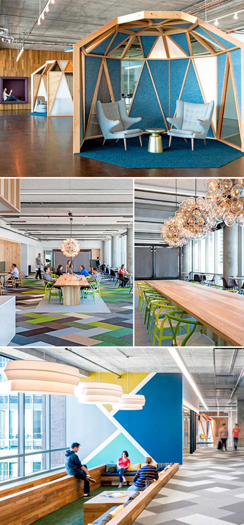
Gorgeous details from this Cisco office, designed by Studio O+A. Every collaborative space has a unique personality and palette, catering to groups small and large, formal and informal. The environment feels like the sophisticated older sister of the play-as-work-as-play office trend. I certainly love the yurts!

friday inspiration


balloflight

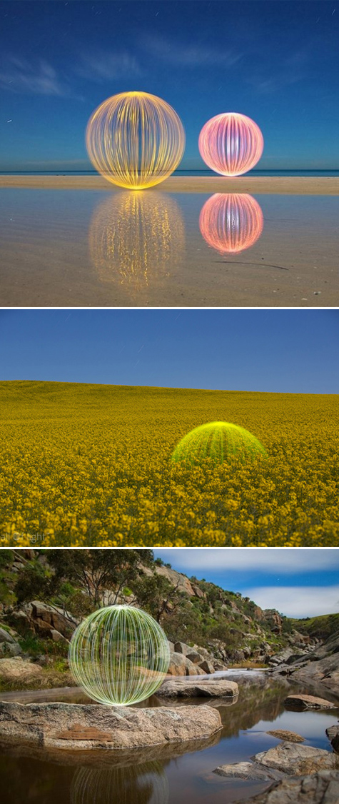
Ball of Light is a beautiful light photography series by Denis Smith. Long exposure time (10+ minutes) allow the artist to connect with the landscape and explore new territories. All sans Photoshop!

via Frame

looks like music


chaser01

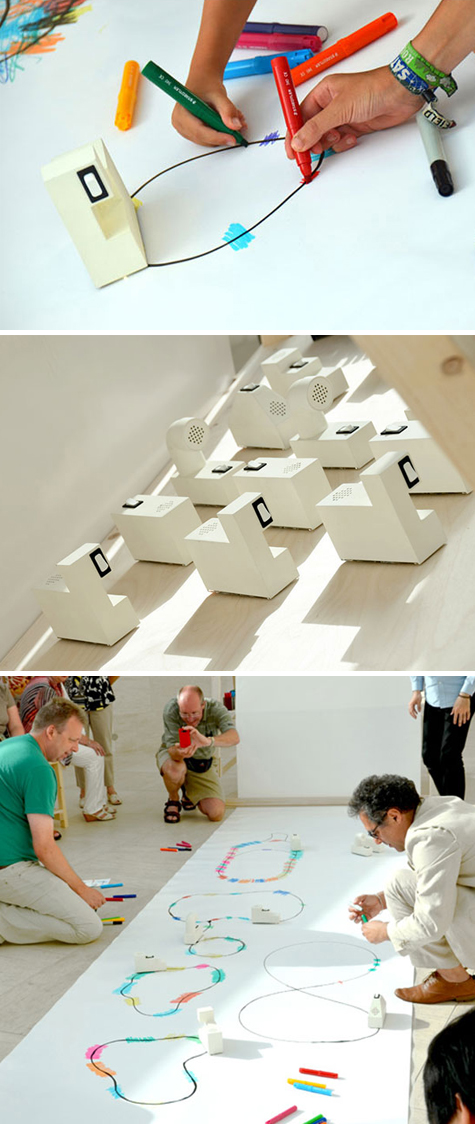
Sound artist Yuri Suzuki designed this delightful interactive installation in which a miniature vehicle - the color chaser - detects and follows a black line and translates crossing coloured lines as RGB data into sound. In an interview with Dezeen, Yuri said, “I am dyslexic and I cannot read musical scores. However, I have a passion to play and create new music and I always dream to create new notation of music.”

via Dezeen

san fran design week poster


sanfranposter

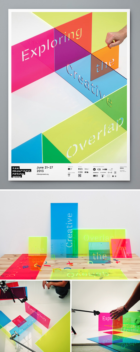
Translucent, colored laser cut plexiglas create this lovely poster for San Francisco Design Week. The identity work, designed by Manual Creative, was based on the concept ‘Exploring The Creative Overlap’. Marvelous!

via Plenty of Colour

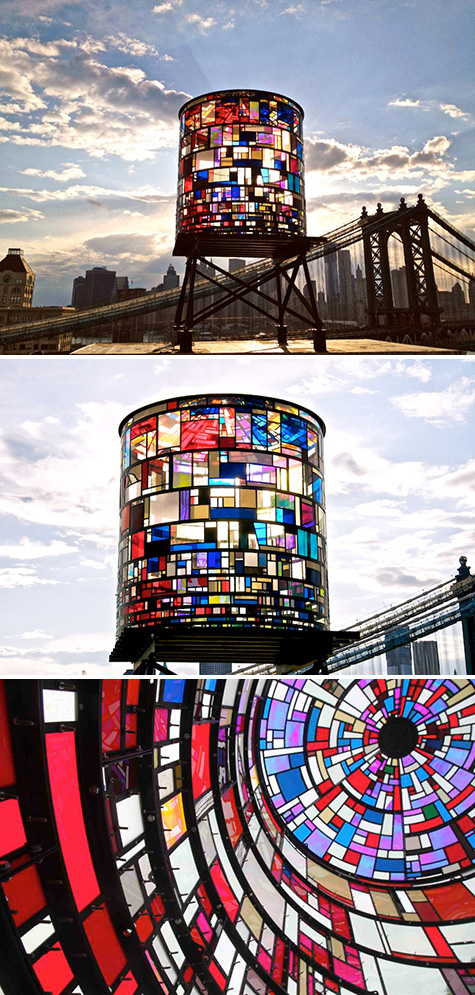
watertower by tom fruin


watertower

Located in Dumbo, Brooklyn, Watertower is composed of 1,000 scraps of plexiglas and reclaimed steel. The iconic tower is illuminated by the sun during the day and by Ardunio-controlled light sequences designed by Ryan Holsopple at night. Created by Tom Fruin.

via My Modern Met

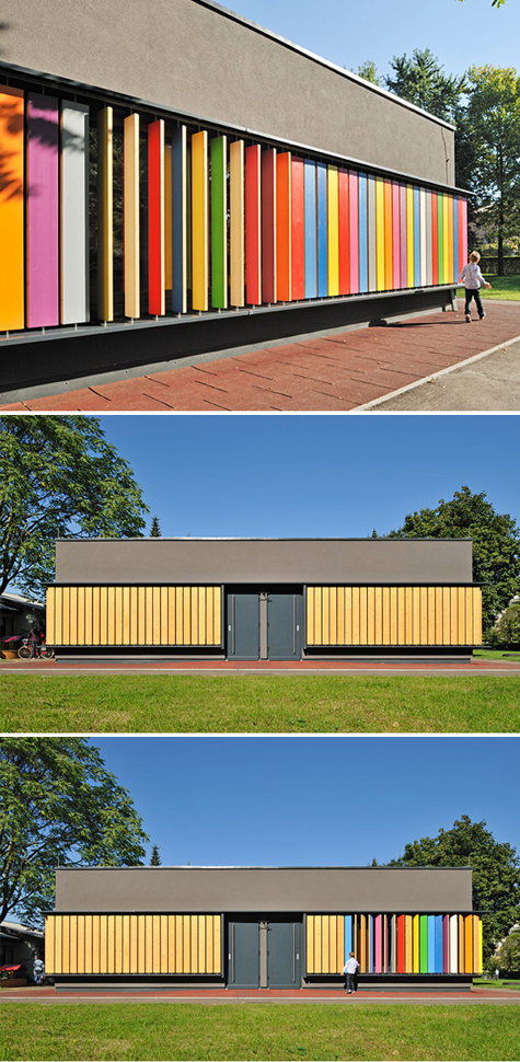
kindergarten kekec


school01school02

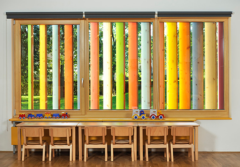
Kindergarten Kekec is an extension to an existing kindergarten building that utilizes colorful wooden shutters as compensation for the school's lack of outdoor play equipment. Aside from serving as a shading element, the toy slats provide for children's play and learning: as the children manipulate the colourful wooden planks they get to know different colours, experience wood as a natural material, and are constantly change the appearance of their kindergarten, all at the same time. Designed by Jure Kotnik Architecture.

via Plenty of Colour

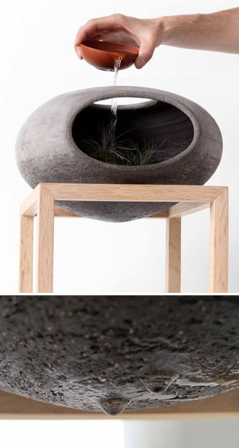
wellspring


water01 water02

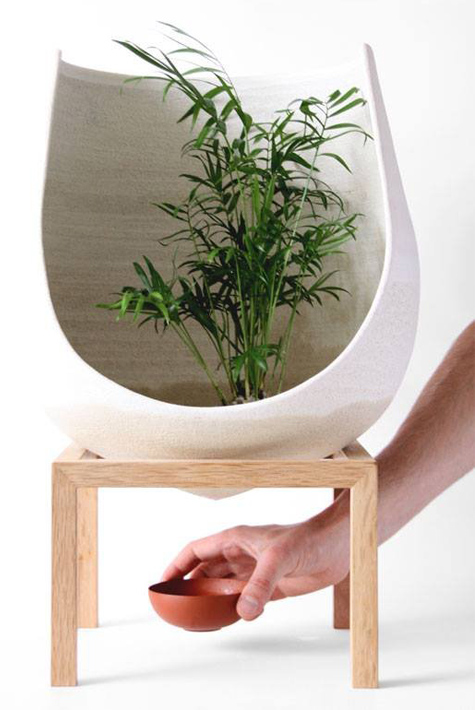
Wellspring, by Martín Azúa, is an invitation to investigate and understand the natural processes to restore the relationship with the environment. It simulates an ecosystem through soil, rocks and plants, able to recover its natural balance. I love not only the form and texture of the vessels but also the passive interaction one has with them.

via Contemporist

vice & velvet


vice01 vice02

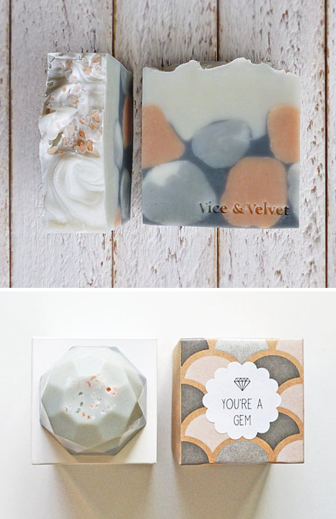
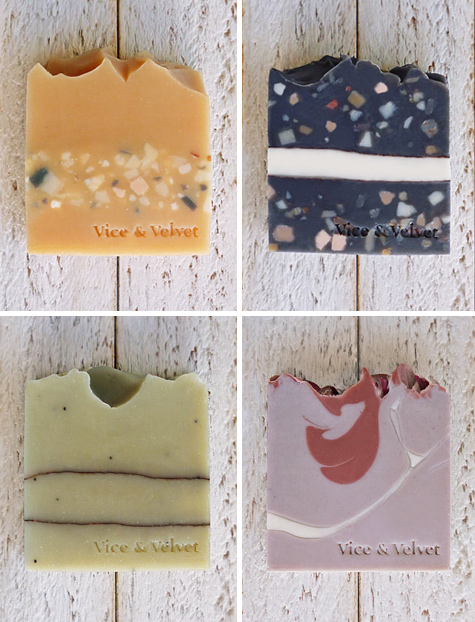
Vice & Velvet creates a beautiful line of handmade soaps. The final forms are geological, reminiscent of layers of earth, with an enticing yet subdued color palette that isn't overly feminine.

iroha


iroha

Iroha is a lovely, minimal line of female adult toys. The vibrators have a similar look to traditional Japanese confectioneries and the packaging is intended to be as inviting as a box of sweets.

via The Dieline

hermès exhibition


hermes01 hermes02

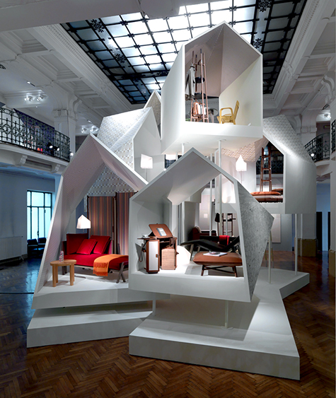
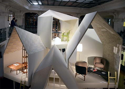
Hermès recently unveiled its new collection of furniture, fabrics and wallpapers, as well as some bespoke pieces at Milan Salone del Mobile in April. The exhibit composed the new collections within stacked, symbolic houses, which provided a frame for viewing and appreciating the furniture and products.

Hermès is enriching the home with a host of new creations: “Les Nécessaires d’Hermès,” a range of cleverly designed, comfortable and multi-functional pieces of furniture imagined by French designer Philippe Nigro; a collection of furnishing fabrics and wallpapers, each with its own story to tell; and bespoke furniture creations designed to enhance exceptional interiors.

via designboom
friday inspiration


icecubes

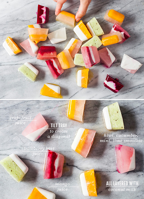
I know summer's just about over - and thank goodness for that! - but if you're searching for a way to hold onto its delicious colors and flavors, try making these delectable fruity summer striped ice cubes from Oh Joy! She combines juices, smoothies and coconut milk to form these perky treats that only bring more happiness as they melt. Happy Friday!

via Oh Joy!

the little free library


freelibrary

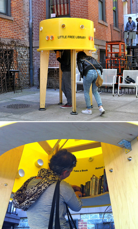
The Architectural League of New York partnered with Pen World Voices Festival and asked ten design agencies to come up with new types of Little Free Libraries.

Stereotank's design created an 'inhabitable' library, where users could immerse themselves and take the time to browse through books and borrow or exchange them. The structure is built out of an upside down plastic tank and a wooden frame. Perforations around the tank allow visitors to peek inside and preview the interior, which invites them to duck under and discover the book collection while still having a connection with the exterior. Wonderful!

via Pop Up City

IBM's smarter cities


ibm

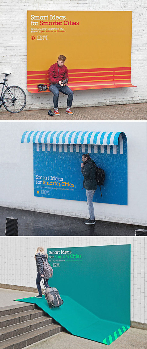
Ogilvy & Mather France designed a series of slarge-scale, dual-purpose ads for IBM's Smarter Cities campaign. The billboards embody the company's mission, transforming static advertisements into useful urban tools. The critical part of my brain thinks the ramp is a bit misleading since it probably doesn't meet ADA standards for slope, but it's creative nonetheless!

via 2Modern

colorful canoe paddles


paddles

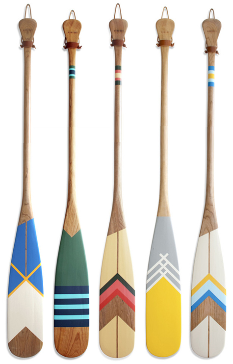
I'm still enjoying the hipster camping trend, and jumping on that bandwagon is Norquay, a creator of pleasantly painted cherry wood canoe paddles. The paddles are, of course, not recommended for the rigors of extended wilderness trips, but would certainly look snappy on a cabin wall.

via 2Modern

strike matchbox


matchbox

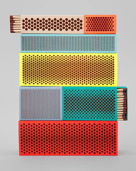
The Strike Matchbox is a perfect example of no product or experience being too small for great design. Shane Schneck "honors the the activity of creating a flame" with his lovely red phosphorus patterns. The final packaging is both bold and minimal, void of other graphic branding elements.

via Moco Loco

colorplan swatch book


color01 color02

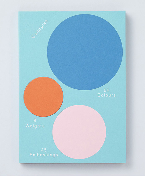
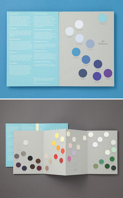
This playful swatch book, designed by Made Thought for Colorplan, uses a swirling, gridless layout to highlight the paper company's color, weight, and paper embossing options. Check out Colorplan's delightful website, which continues the dotted swatch theme.

via Plenty of Colour

friday inspiration


aerial1aerial2

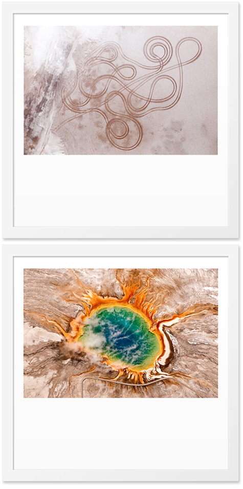
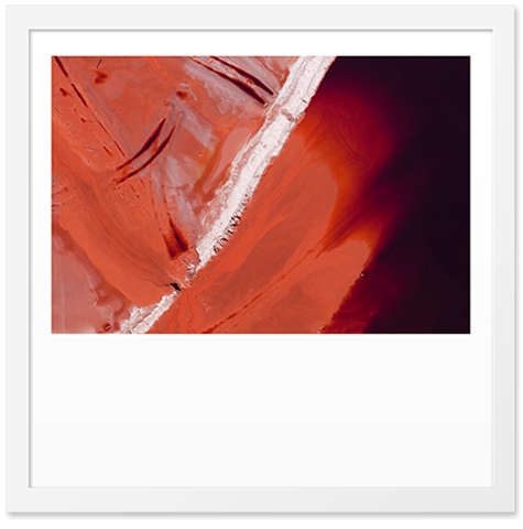
Painterly aerial photography from the husband and wife team Patterns From Above. Happy Friday!

bronco stool


bronco

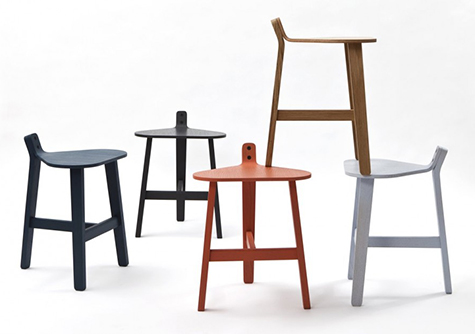
I love the subtle sprout in the rear of this stool seat that playfully implies a saddle and also serves as a short handle or a place to loop your bag and sweater. The Bronco Stool, designed by Guillaume Delvigne for super-ette. To view more by this artist, see his porcelain bowl that can be embroidered in this DV post.

via Contemporist

cass art packaging


cass01 cass02

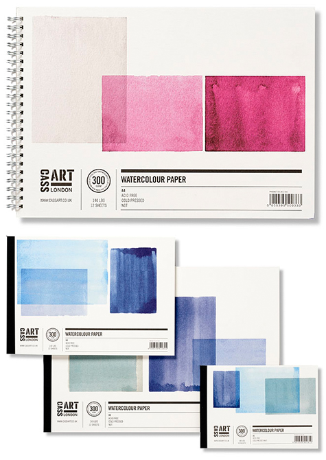
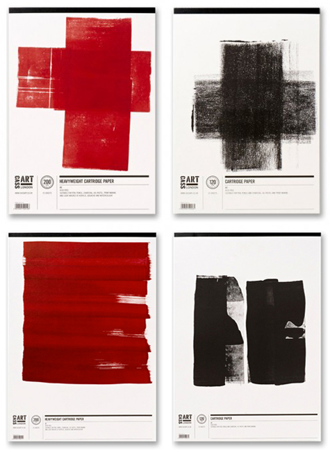
The clean, minimal layout of the Cass Art packaging allows the stock and the paint medium to express the quality of the product. The result is a bold, textural statement about the unique performance of each paper pad. Lovely and inspirational! Designed by Pentagram.

via The Dieline and Lovely Package

textielmuseum and textiellab identities


textile01 textile02

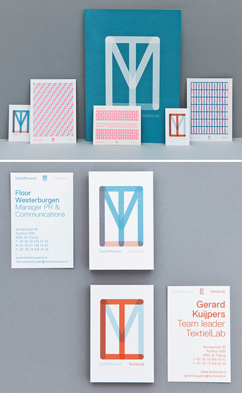
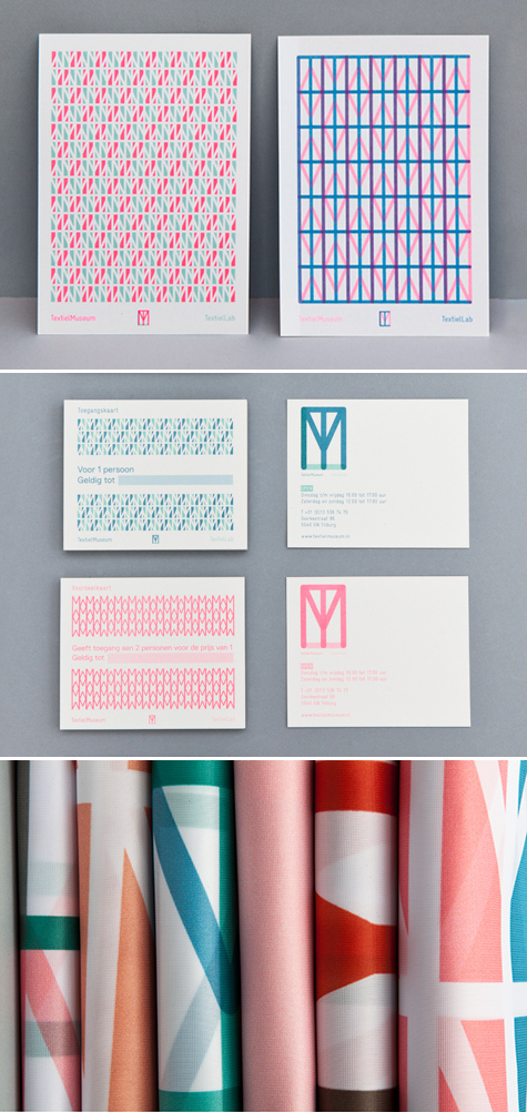
Beautiful identity work for the TextielMuseum and TextielLab in the Netherlands by Raw Color. Next to hosting exhibitions about textile and design at the Museum, the Lab produces and develops textile projects with contemporary designers and artists. The letters T, M and L overlap with different opacities and color combinations, and the design quickly becomes its own woven textile, especially when repeated.

via Plenty of Colour